
Architecture in Street Photography: Using Lines, Shadows, and Scale to Anchor a Scene
Walk down almost any street and the buildings are doing more work than we give them credit for. They frame, they shade, they compress and stretch. A figure crossing a bright plaza reads one way against a striped wall and another against a blank grey one, and a person standing under a colonnade gains weight from the rhythm of columns behind them. Architecture gives a street photograph its grammar: verticals keep the frame upright, shadows carve out shape, and scale tells us whether a moment is small and private or vast and public. Learning to see those elements before you press the shutter is often the difference between a photograph of a stranger and a photograph that holds together.
The Street Is Already a Set
Most advice about street photography circles the human side: get close, anticipate, watch hands, don't blink. All of that matters. But structure decides whether the frame is legible at a glance. A good reaction on a busy pavement can still dissolve if the background is a tangle of signage and half a dozen other pedestrians. A quieter moment — someone waiting, someone walking away — can become memorable because a wall of windows, a low sun, and one clean diagonal give it a shape.
The practical shift is to read the space before you read the people. When you arrive somewhere promising, spend a few minutes doing nothing but looking: where is the light coming from, where does it stop, which edges of the frame do something, and where would a person have to stand for the picture to assemble itself? That small inventory turns a street from a place you walk through into a place you can work.
Lines: The Skeleton of the Frame
Lines are the cheapest structure available to you, and they are everywhere: kerbs, tram rails, painted markings, railings, the seam where paving changes, the edge of an awning, the long shadow of a cable. They do two jobs. They pull the eye across the frame, and they hold everything else in place.
Find the vanishing point, then decide who owns it
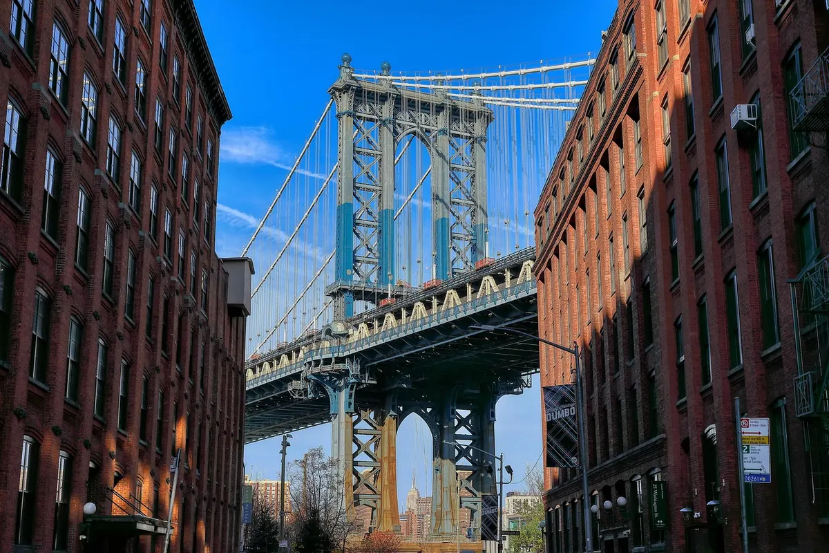
A street that narrows toward the distance creates a point where the eye wants to land. You can put a subject near that point and let the lines deliver the viewer to them, or you can leave it empty and wait for someone to walk into it. The second approach is usually stronger because the geometry is already fixed and the person arrives as an event rather than a decoration. Stand at the wide end of the corridor, set the frame, and be patient for two or three minutes.
Verticals and the horizon
Decide early whether your verticals will be straight. If you want the building to stand upright, keep the camera level and accept the extra foreground; tilting up with a wide lens makes walls lean inward and, unless you want that lean, it reads as a mistake. Horizon placement does quiet work too: high horizon and the pavement dominates, low horizon and the architecture towers. Neither is correct. Just choose one on purpose rather than letting it land wherever the camera happens to sit.
Repetition, and the break in it
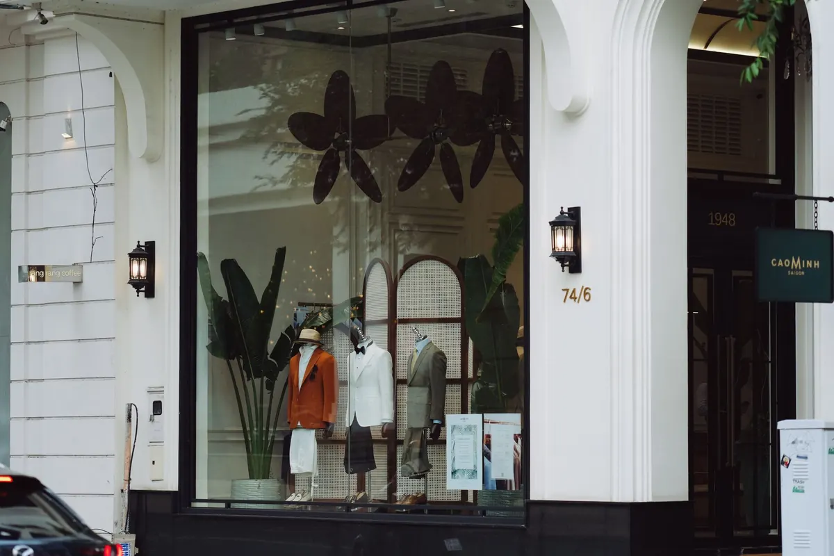
Windows, shutters, arches, balconies, bollards, the gaps between columns. Repeated elements build rhythm, and rhythm is what makes a single break feel loud: one open window among closed ones, one figure among empty doorways, one red coat in a street of grey. Find the pattern first, then wait for the interruption. This is one of the few reliable recipes in the craft.
Shadows: Contrast You Don't Have to Chase
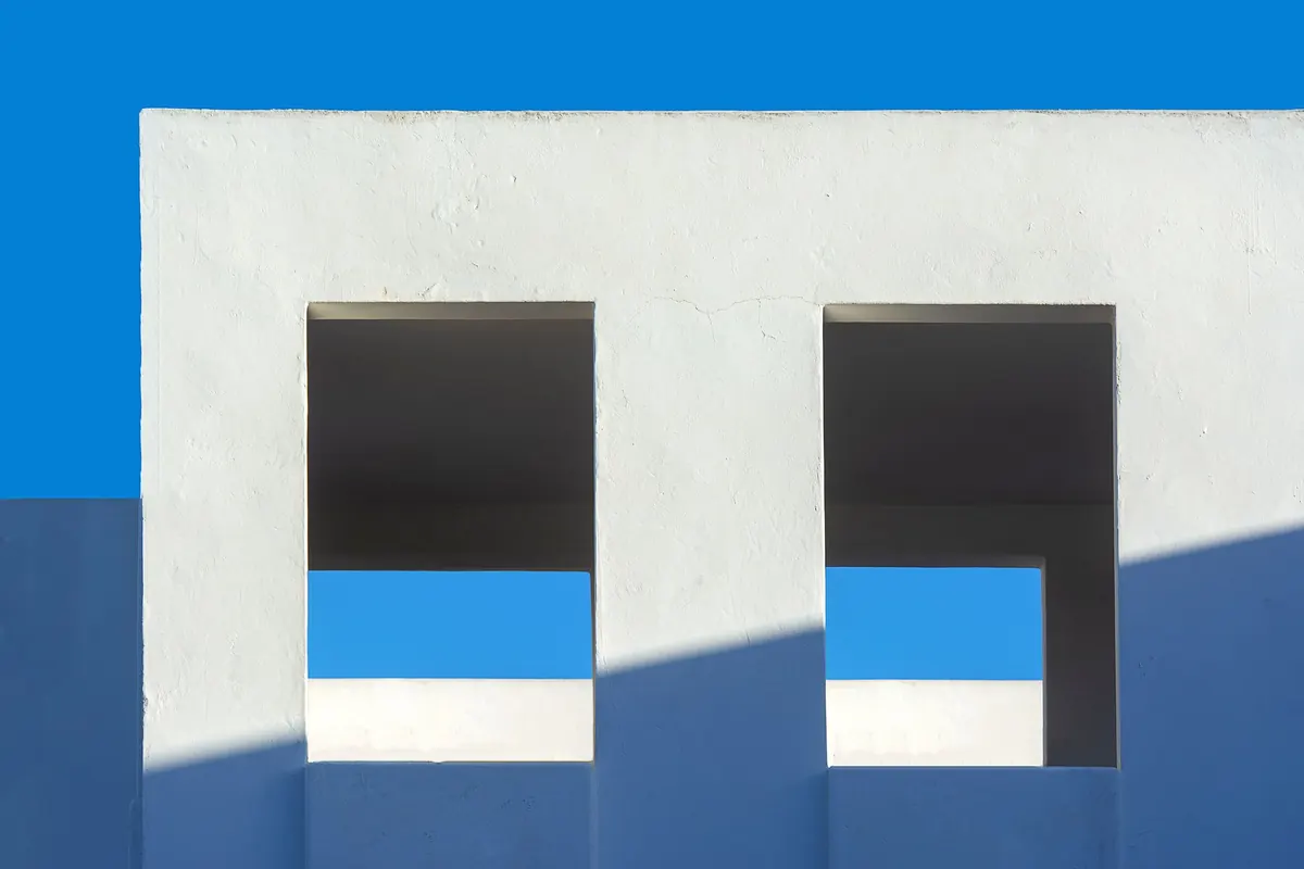
Midday is often treated as a lost cause, which is a shame, because hard light hands you free graphic material. A shadow edge is a line you did not have to construct, and a pool of darkness is a frame inside your frame.
Three uses are worth practising. First, the diagonal: a shadow crossing a wall or pavement slices the frame and gives you somewhere to place a figure — on the lit side for separation, on the edge for tension. Second, the doorway or archway as a dark border that isolates a lit subject inside it. Third, shadow as subject in its own right: silhouettes, a bicycle's shadow on a sunlit wall, the elongated legs of passers-by at the end of the day.
Exposure is straightforward once you decide what matters. If the lit surface carries the picture, meter for it and let the shadows go deep; that darkness is structure, not loss. If you want detail in both, look for a wall catching bounced light in the shade — narrow streets and white facades are generous this way. And remember that shadows move. A wall you liked at eleven will be a different photograph at three, and the shadow of a lamp post can travel across a doorway in twenty minutes. Find the geometry, note the time, come back.
Scale: Why Distance Changes Meaning
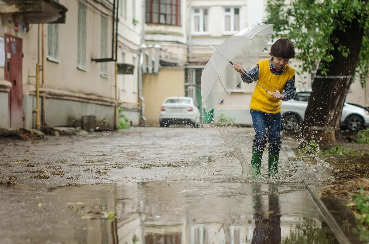
Two people can stand in the same street and make opposite pictures, because scale is a choice. Pull back and let a human become small against a façade, and you say something about the city: its weight, its indifference, its geometry. Move in and let the architecture compress behind them, and the person takes over while the building becomes texture. Both are honest. Neither is better.
Lens and distance work together. A wide lens exaggerates the foreground, pushes the background away, and makes small figures feel smaller still — useful for grandeur, awkward for faces. A 35mm or 50mm keeps proportion closer to the way we experience a street, which is why it suits quieter, more observational frames. Changing your height changes scale just as much: a high vantage point from an overpass, a parking garage, or a station exit flattens people into marks on the pavement and turns crossings and markings into patterns. Crouching does the reverse, giving a passer-by a monumental backdrop.
One reliable trick: use a repeated architectural unit as a ruler. A person beside a doorway, a tram window, or a row of bollards reads instantly as small or large because the viewer has something to compare against. Without that unit, scale is abstract.
A Working Method in Five Moves
- Read the light first. Before anything else, find which surfaces are lit and which are not. Light decides where the picture is.
- Choose one strong line and stand at its origin. One line, not four. Let the frame do one job well.
- Set the frame and expose for the bright side. Lock your settings, pre-focus where a subject would appear, and stop fiddling.
- Decide where the human belongs. Pick the spot — sunlit patch, third column, the break in the rhythm — and wait for someone to occupy it.
- Give it five minutes. Most good structural frames are made in the waiting, not the walking.
Mistakes That Flatten a Scene
- A busy background merging with a subject's head or silhouette.
- Crooked verticals nobody intended, which make the whole frame feel careless.
- Chasing beautiful shadows with no one in them — structure without a subject is an architectural study.
- Shooting everything at eye level, which is the least interesting height on a street.
- Zooming in too quickly instead of using distance to decide how the scene should read.
- Ignoring the edges of the frame, where half your distracting clutter lives.
A Practical Field Routine
Take one lens and one wall. Give yourself twenty minutes in a single spot with a strong architectural feature — a colonnade, a striped façade, a staircase, a shaft of light between two buildings — and make fifteen frames of it as people pass. Vary your height, vary your distance, vary where you place the figure in the frame. Then review at thumbnail size: the frames that still read as shapes, with the person clearly placed inside the geometry, are the ones you were after. Do that once a week and the reading becomes automatic; you will start seeing the line, the shadow, and the empty spot before anyone walks into it.
Photo: Jan van der Wolf / Pexels